I’ve been using smartwatches for 3 years now — even before the first Pebble Watch was shipped, and even before most people know what smartwatches are.
My first smartwatch was a Sony Ericsson LiveView launched all the way back in 2010. And, the LiveView wasn’t even Sony’s first attempt at smartwatches.
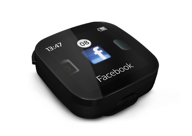
The Sony Ericsson Live View was launched in 2010. Photo via sonymobile.com
Smartwatches were already pretty advanced back then. Sony just didn’t spend marketing dollars to whip up a consumer frenzy backend.
The second smartwatch I had was the Sony SmartWatch.
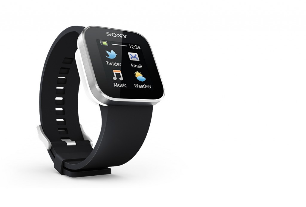
Sony SmartWatch. Photo via sonymobile.com.
My third smartwatch is the Moto 360 from Motorola, which is a smartwatch that finally runs on Android Wear. The LiveView had cost me S$69, the Sony SmartWatch cost S$150 and the Moto 360 cost S$330.
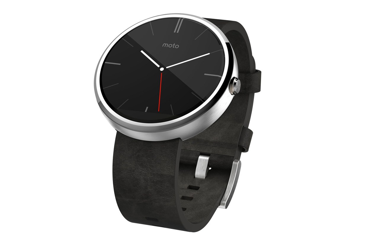
The Moto 360 smartwatch. Photo: Motorola
Over the three years when I was using smartwatches, I have developed my own set of criteria for what makes the user experience for a great smartwatch.
In my opinion, the Apple Watch has not lived up to expectations when it comes to providing fans an ideal smartwatch user experience. Here’s why:
Weight
When I first got my Moto 360, I was surprised by how light it was. Weighing just a cool 49g, it was less than 65% the weight of most Apple Watch variants. For something that can only serve to be useful if you wear it on your wrist all the time, wearing the Apple Watch would become a burden. Unless of course, your motivation to show off the latest shiny gadget outweighs the discomfort for you.
Standby Battery Life
We don’t use our watches all the time, or expect to do so. A good smartwatch should be able to survive occasional usage and glimpse throughout the day. This is an area which Sony completely failed in, but the Moto 360 and Apple Watch have gotten right.
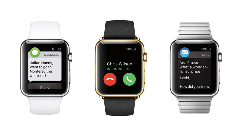
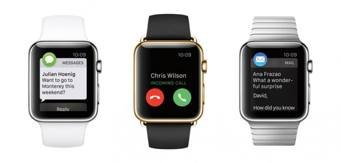
The different variants of the Apple Watch. Photo: Apple
Ease of Glimpse
While wearing a smartwatch, we constantly take quick glimpses at the time and notifications throughout the day. The first Sony required a button press before the screen turned on – that’s a big no no and a crap deal in terms of usability. The second Sony supposedly had the ability to automatically turn on the screen when I lifted my wrist – but it worked only 30% of the time. I hated it.
Accordingly to reports, there is a huge lag time before raising your wrist and having Apple Watch automatically turn on its screen. This makes for a lousy user experience as you don’t get immediate feedback on whether you have raised your hand in a way that would trigger the screen. Users often end up shaking their wrist a few more times to try to get the screen turned on.
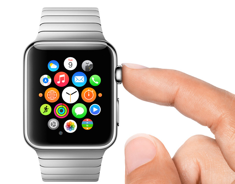
Photo: Apple
Moto 360 solves this by turning the screen to a “dim” mode when you are in the act of raising your wrist, and fully turn on the screen when the watch is somewhat in a horizontal position. From my experience, this worked for me 100% of the time. I didn’t even have to wait for the screen to turn on itself at all. And if it was a false positive (the screen turned on when I was not trying to look at it), having that “dim” mode helps conserve battery life.
Appearance
Now, appearance is highly subjective – but in my case, I want my smartwatch to look like a regular watch. My two Sony smartwatches were thick, ugly chunky gadgets that happened to be attached to wrist straps. The Apple Watch is the same, to me. Only the Moto 360 looks and feels like an actual regular watch to me, and that’s a strong selling point.
Charging Time
We already have too many gadgets to charge every night, and having a watch to charge makes it a pain in the butt. It would make for a really good user experience if you can simply place your smartwatch on the charger as you are getting ready to leave for work in the morning, and have it fully charged before you go — one less gadget to charge overnight.
The Moto 360 typically charges from 40% to 100% in about 30 minutes. The Apple Watch charges from 0% to 80% in 1.5hrs and 0% to 100% in 2.5hrs. Note that charging typically slows down on the last 20% of charge to protect lithum polymer battery health. Looking at the statistics, placing the Apple Watch on the charger just before you leave for work will not give you enough juice for the day, but leaving the watch to charge overnight seems like a waste of electricity (not to mention it harms the battery), and also burden you with an additional gadget to charge every night.
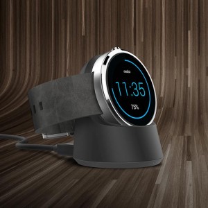
The Moto 360 comes with a small charging stand (pictured above) that simply charges your watch when you place your watch on it. Photo: Motorola
Ease of Charging
There’s only one way to charge an Apple Watch – the Apple magnetic inductive charge cable. You must have the charge cable with you at all times if you want to give the Apple Watch a quick top-up. Imagine having to shuttle this (overpriced) cable to and fro your home and office. Utterly troublesome. Having one more charging cable incompatible with all your other gadgets only adds to frustration and mess.
The Moto 360 uses the Qi inductive charging standard. My watch, my Samsung Note 4 phone and my Nexus 7 tablet all charge wireless. I have one charging pad at my home workspace and one at my office workspace. That is all that is required to charge every single one of the gadgets I have. To charge, I simply place the gadget on the pad. There is no messy wire to unplug, plug, or position, unlike with the Apple Watch.
The Moto 360 also comes with a small convenient charging stand that simply charges your watch when you place your watch on it. Nothing to align, unlike Apple’s offering.
Conclusion
So, what went wrong? Perhaps Tim Cook was desperate for a new product category to show customers and investors that Apple still has it. Or, perhaps the Apple Watch was rushed, given how mature the smartwatch market was by the time Apple Watch is ready.
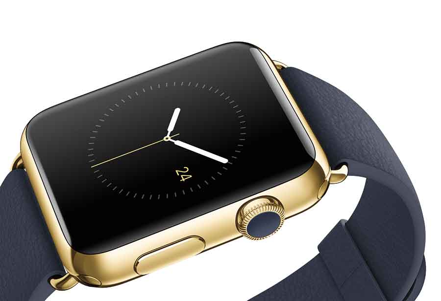
The Apple Watch Edition costs a cool US$10,000 to US$12,000 each. Photo: Apple
Maybe Apple doesn’t really care about the user experience that much now — it is a marketing-centric company and the points I’ve mentioned above won’t really make too much of a difference to their marketing angles or initial sales. Or, maybe it’s more about the money. Apple Watches are cheap to make. Even the gold treatment shouldn’t cost this much.
Could this be about profits in plain and simple terms? No one knows for sure. Either way, this is certainly not the smartwatch that loyal Apple fans deserve.



1 Comment
Pingback: 5 Reasons Why I Love Apple Watch and Pebble Time Watch - Asia 361